import matplotlib.pyplot as plt
from matplotlib.ticker import (MultipleLocator, AutoMinorLocator, FuncFormatter)
import seaborn as sns
import numpy as np
# 그냥 그림을 그릴 때 zorder의 값을 지정해주면 그 값이 레이어의 위치라고 보면 된다.
# 가장 바깥 쪽에 그려지는 그림일수록 zorder의 값이 커야 한다.
# zorder는 레이어의 위치

def plot_example(ax, zorder=0):
    ax.bar(tips_day["day"], tips_day["tip"], color="lightgray", zorder=zorder)
    ax.set_title("tip (mean)", fontsize=16, pad=12)

    # Values
    h_pad = 0.1
    for i in range(4):
        fontweight = "normal"
        color = "k"
        if i == 3:
            fontweight = "bold"
            color = "darkred"

        ax.text(i, tips_day["tip"].loc[i] + h_pad, f"{tips_day['tip'].loc[i]:0.2f}",
                horizontalalignment='center', fontsize=12, fontweight=fontweight, color=color)
        # 막대 플롯 위에 텍스트를 작성하는 코드
        # i : x 위치값 , tips_day["tip"].loc[i] + h_pad : y 위치값
        # f"{timps_day['tip'].loc[i]:0.2f}" 의 timps_day['tip'].loc[i]:0.2f는
        # 키값을 의미하며 코드 실행시 key에 대한 value 값이 나온다.
        # :0.2f는 소수점 2자리까지 나타낸다는 것을 의미한다.
        # horizontalalignment 파라미터는 'center','left','right'로 지정할 수 있는데
        # center로 지정할 시 텍스트가 막대 그래프 위쪽 부분에서 중앙에 위치해 있으며
        # left로 지정할 시 텍스트가 막대 그래프 위쪽 부분에서 오른쪽으로 치우쳐져 있고
        # right로 지정할 시 텍스트가 막대 그래프 위쪽 부분에서 왼쪽으로 치우쳐져 있다.
        # fontweight : 글씨체

    # Sunday
    ax.patches[3].set_facecolor("darkred") # 세번째 막대기 테두리 안의 색 지정
    ax.patches[3].set_edgecolor("black") # 세번째 막대기 테투리의 색 지정

    # set_range
    ax.set_ylim(0, 4) # y축의 범위를 0에서부터 4까지로 지정한다.
    return ax

def major_formatter(x, pos): # 단위를 소수점 둘째자리로 format한다.
    return "{%.2f}" % x
formatter = FuncFormatter(major_formatter)
tips = sns.load_dataset("tips")
tips_day = tips.groupby("day").mean().reset_index() # 기존 행 인덱스를 제거하고 인덱스를 데이터 열 추가
print(tips_day)
    day  total_bill       tip      size
0  Thur   17.682742  2.771452  2.451613
1   Fri   17.151579  2.734737  2.105263
2   Sat   20.441379  2.993103  2.517241
3   Sun   21.410000  3.255132  2.842105
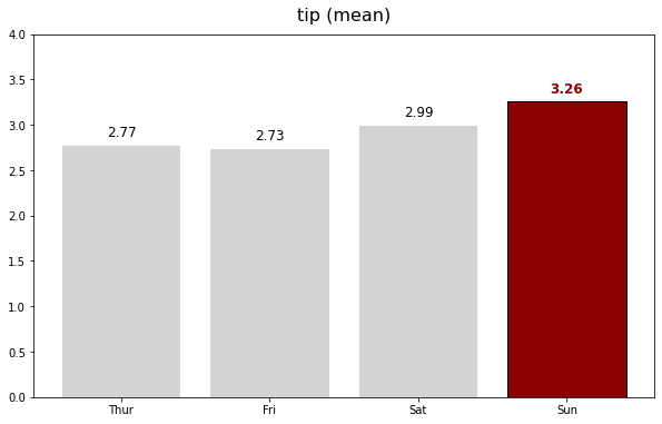
fig, ax = plt.subplots(figsize=(10, 6))
ax = plot_example(ax, zorder=2)
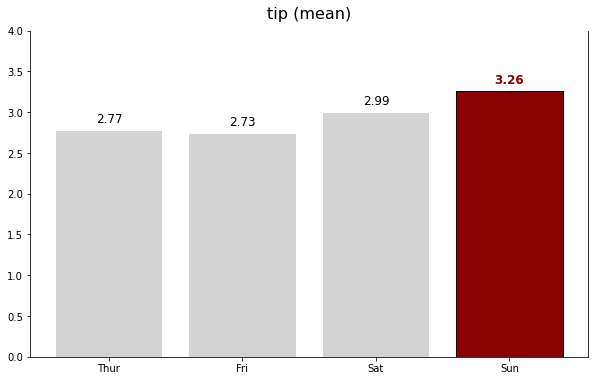
fig, ax = plt.subplots(figsize=(10, 6))
ax = plot_example(ax, zorder=2)

ax.spines["top"].set_visible(False) # 위쪽 테두리 숨기기
ax.spines["right"].set_visible(True) # 오른쪽 테두리
ax.spines["left"].set_visible(True) # 왼쪽 테두리
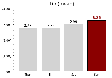
fig, ax = plt.subplots()
ax = plot_example(ax, zorder=2)

ax.spines["top"].set_visible(False)
ax.spines["right"].set_visible(False)
ax.spines["left"].set_bounds(1,3) # spine 범위 지정하기 .set_bounds(min, max)
                                  # spine을 일부 영역만 보여주고 싶을 때 사용

ax.yaxis.set_major_locator(MultipleLocator(1)) # matplotlib 라이브러리의 축 모듈에서 set_major_locator()은 주 눈금자의 로케이터를 설정하는 데 사용됩니다.
ax.yaxis.set_major_formatter(formatter) # matplotlib 라이브러리의 축 모듈에서 set_major_locator()은 주 눈금자의 formatter를 설정하는 데 사용됩니다.
                                        # 이 코드에서는 y축의 눈금자의 값을 소수점 둘째자리 단위까지 나타냅니다.
ax.yaxis.set_minor_locator(MultipleLocator(0.1)) # matplotlib 라이브러리의 축 모듈에서 set_minor_locator()은 보조 눈금자의 로케이터를 설정하는 데 사용됩니다.
                                                 # 보조 눈금자의 크기는 주 눈금자 크기의 1/10
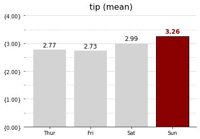
fig, ax = plt.subplots()
ax = plot_example(ax, zorder=2)

ax.spines["top"].set_visible(False)
ax.spines["right"].set_visible(False)
ax.spines["left"].set_visible(False)

ax.yaxis.set_major_locator(MultipleLocator(1))
ax.yaxis.set_major_formatter(formatter)
ax.yaxis.set_minor_locator(MultipleLocator(0.5))

ax.grid(axis="y", which="major", color="lightgray")
ax.grid(axis="y", which="minor", ls=":")
# axis : 하이퍼 파라미터로써,변화를 적용하고자 하는 axis를 입력한다.
# which : 하이퍼 파라미터로써, 변화를 적용하고자하는 grid line을 입력한다.
# ls : line style, 이 코드에서는 보조 눈금선을 점선으로 표현한다.
# color : 선의 색
import matplotlib.pyplot as plt
import seaborn as sns
import numpy as np

tips = sns.load_dataset("tips")
fig, ax = plt.subplots(nrows = 1, ncols = 2, figsize=(16, 5))

print(tips.columns)

# Ideal Bar Graph
ax0 = sns.barplot(x = "day", y = 'total_bill', data = tips,
                  ci=None, color='lightgray', alpha=0.85, zorder=2,
                  ax=ax[0])
# ci : float or “sd” or None, optional
#  float일 경우 신뢰구간 값을 추정하고 sd일 경우 부트스트래핑 즉
# 주어진 데이터로부터 복원 표본을 구하는 작업을 여러 번 반복해 원하는 값을 추정하는 작업을
# 생략하고 표준 편차 값을 구하며 None일경우에 부트스트래핑 작업을 하지 않으며
# error bar가 나타나지 않는다.
# alpha : 색의 채도의 비율을 나타낸다.
# ax :plot 안에 그려넣을 Axes 객체를 가르킴. ax[0]:왼쪽그림, ax[1]:오른쪽 그림

group_mean = tips.groupby(['day'])['total_bill'].agg('mean')
h_day = group_mean.sort_values(ascending=False).index[0] # ascending=False --> 내림차순
h_mean = np.round(group_mean.sort_values(ascending=False)[0], 2)
for p in ax0.patches: # 4개의 patch --> Thursday, Friday, Saturday, Sunday
  fontweight = "normal"
  color = "k"
  height = np.round(p.get_height(), 2)


group_mean = tips.groupby(['day'])['total_bill'].agg('mean')
h_day = group_mean.sort_values(ascending=False).index[0] # 내림차순으로 나열하였으므로 인덱스 0 위치가 가장 높은 평균을 가지고 있는 날짜를 의미함.
h_mean = np.round(group_mean.sort_values(ascending=False)[0], 2) # 가장 높은 평균, 즉 Sunday의 평균 21.41
for p in ax0.patches:
  fontweight = "normal"
  color = "k"
  height = np.round(p.get_height(), 2)
  if h_mean == height:
    fontweight="bold"
    color="darkred"
    p.set_facecolor(color)
    p.set_edgecolor("black")
  ax0.text(p.get_x() + p.get_width()/2., height+1, height, ha = 'center', size=12, fontweight=fontweight, color=color)

ax0.set_ylim(-3, 30)
ax0.set_title("Ideal Bar Graph", size = 16)

ax0.spines['top'].set_visible(False)
ax0.spines['left'].set_position(("outward", 20)) # left spine을 왼쪽으로 20만큼 이동
ax0.spines['left'].set_visible(False)
ax0.spines['right'].set_visible(False)

ax0.set_xlabel("Weekday", fontsize=14)
for xtick in ax0.get_xticklabels():
  if xtick.get_text() == h_day:
    xtick.set_color("darkred")
    xtick.set_fontweight("demibold")
ax0.set_xticklabels(['Thursday', 'Friday', 'Saturday', 'Sunday'], size=12)

ax0.set_ylabel("Avg. Total Bill($)", fontsize=14)

ax0.grid(axis="y", which="major", color="lightgray")
ax0.grid(axis="y", which="minor", ls=":")

ax1 = sns.barplot(x = "day", y = 'total_bill', data = tips,
                  ci=None, alpha=0.85,
                  ax=ax[1])
for p in ax1.patches:
  height = np.round(p.get_height(), 2)
  ax1.text(p.get_x() + p.get_width()/2., height+1, height, ha = 'center', size=12)
ax1.set_ylim(-3, 30)
ax1.set_title("Just Bar Graph")

fig.show()
Index(['total_bill', 'tip', 'sex', 'smoker', 'day', 'time', 'size'], dtype='object')


<ipython-input-9-93d5c5bd5127>:74: UserWarning: Matplotlib is currently using module://ipykernel.pylab.backend_inline, which is a non-GUI backend, so cannot show the figure.
  fig.show()
