Tabular Playground Series - Apr 2021, Titanic 데이터셋 시각화 공부
Page content
Tabular Playground Series - Apr 2021, Titanic 데이터셋 시각화 공부
Matplotlib : 차트의 기본 크기를 설정하려면?
rcParams
- Matplotlib에서 그리는 그래프,폰트 등의 기본 값을 설정합니다.
- plt.rcParams와 mpl.rcParams 모두 동일한 결과를 도출하므로 편한 것을 사용하면 됩니다.
- 사용 가능한 rcParams 항목 : plt.rcParams
- 초기값으로 되돌리기 : mpl.rcParams.update(mpl.rcParamsDefault)
%matplotlib inline
import matplotlib as mpl
import matplotlib.pyplot as plt

mpl.rcParams["figure.figsize"] = (14,4)
mpl.rcParams['lines.linewidth'] = 2
mpl.rcParams['lines.color'] = 'r'
mpl.rcParams['axes.grid'] = True
mpl.rcParams['figure.dpi'] = 120
mpl.rcParams['axes.spines.top'] = False
mpl.rcParams['axes.spines.right'] = False
‘figure.figsize’ : 그림(figure)의 크기.(가로,세로)인치 단위 ‘lines.linewidth’ : 선의 두께 ‘lines.color’ : 선의 색깔 ‘axes.grid’ : 차트 내 격자선(grid) 표시 여부 ‘figure.dpi’ : 인치당 도트 수에서의 그림 해상도입니다.
Figure와 subplots
한 화면에 여러 개의 그래프를 그리려면 figure 함수를 통해 Figure 객체를 먼저 만든 후 add_subplot 메서드를 통해 그리려는 그래프 개수만큼 subplot을 만들면 됩니다.
subplot의 개수는 add_subplot 메서드의 인자를 통해 조정할 수 있습니다.
fig = plt.figure(figsize=(15, 11))

gs = fig.add_gridspec(3, 4)  # row size * column size 형태의 1차원 어레이, subplot 사이즈 조절
add_gridspec 메서드를 통하여 한 화면을 3x4(행x열)로 나눕니다
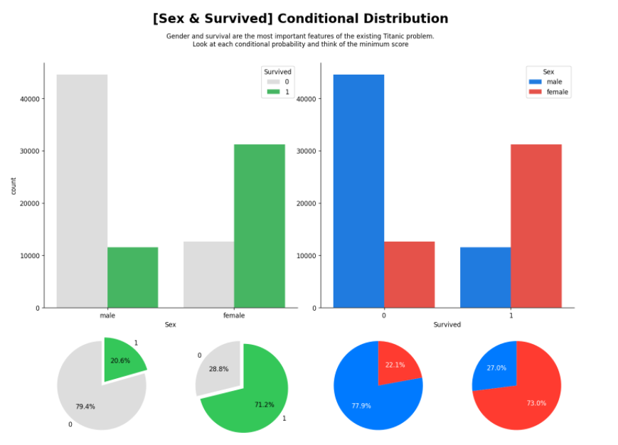
ax_sex_survived = fig.add_subplot(gs[:2,:2]) # 행 : 1~2, 열 : 1~2 범위의 2x2(행x열) subplot을 생성합니다.
sns.countplot(x='Sex',hue='Survived', data=train, ax=ax_sex_survived,
              palette=survived_palette)

ax_survived_sex = fig.add_subplot(gs[:2,2:4], sharey=ax_sex_survived) # 행 : 1~2, 열 : 3~4 범위의 2x2(행x열) subplot을 생성합니다.
sns.countplot(x='Survived',hue='Sex', data=train, ax=ax_survived_sex,
              palette=sex_palette
             )

# ax_survived_sex.set_yticks([])
ax_survived_sex.set_ylabel('')

ax_pie_male = fig.add_subplot(gs[2, 0])  # 세 번째 행, 첫 번째 열에 위치하는 subplot 생성
ax_pie_female = fig.add_subplot(gs[2, 1]) # 세 번째 행, 두 번째 열에 위치하는 subplot 생성
ax_pie_notsurvived = fig.add_subplot(gs[2, 2]) # 세 번째 행, 세 번째 열에 위치하는 subplot 생성
ax_pie_survived = fig.add_subplot(gs[2, 3]) # 세 번째 행, 네 번째 열에 위치하는 subplot 생성

# Sex
male = train[train['Sex']=='male']['Survived'].value_counts().sort_index()
ax_pie_male.pie(male, labels=male.index, autopct='%1.1f%%',explode = (0, 0.1), startangle=90,
               colors=survived_palette
               ) # subplot(ax_pie_male에는 pie함수를 호출해서 그래프를 그림


female = train[train['Sex']=='female']['Survived'].value_counts().sort_index()
ax_pie_female.pie(female, labels=female.index, autopct='%1.1f%%',explode = (0, 0.1), startangle=90,
                colors=survived_palette
                 )

# Survived
notsurvived = train[train['Survived']==0]['Sex'].value_counts()[['male', 'female']]
ax_pie_notsurvived.pie(notsurvived, labels=notsurvived.index, autopct='%1.1f%%',startangle=90,
                      colors=sex_palette, textprops={'color':"w"}
                      )

survived = train[train['Survived']==1]['Sex'].value_counts()[['male', 'female']]
ax_pie_survived.pie(survived, labels=survived.index, autopct='%1.1f%%', startangle=90,
                    colors=sex_palette, textprops={'color':"w"}
                   )


fig.suptitle('[Sex & Survived] Conditional Distribution', fontweight='bold', fontsize=20)
fig.text(s='''Gender and survival are the most important features of the existing Titanic problem.\nLook at each conditional probability and think of the minimum score''',
         x=0.5, y= 0.94, ha='center', va='top')

plt.show()
va는 verticalalignment의 약자로 y축에서의 위치를 말합니다.
[‘center’ | ‘top’ | ‘bottom’ | ‘baseline’]으로 되어있고 이중에 하나를 선택해서 씁니다.
ha는 horizontalalignment의 약자로 x축에서의 위치를 말합니다.
[‘center’ | ‘right’ | ‘left’]로 되어있습니다.
f-string
python에서 문자열을 다룰 때는 여러가지 방식으로 사용할 수 있는데 대부분은 기존 python2에서 지원하던
%-formatting 방식과 Format string syntex인 str.format() 메서드 방식을 주로 사용할 것이다.
하지만, 이 방식들은 모두 아쉬운 점이 있는데, 가장 큰 문제로 지적되는 것이 바로 가독성 문제이다.
이를 해결하기 위해서 Python 신규 버전(3.6 이상) 부터는 Literal String Interpolation 이라는,간단히 줄여서 f-string 이라고 불리는 새로운 기능을 제공해 준다.
f-string 은 아래와 같이 'f' 라는 접두사를 통해 간단하게 사용 가능하다.

name = 'Hun'
hobby = 'weight training'

f'Hi, my name is {name}. My hobby is {hobby}.'
>>> 'Hi, my name is Hun. My hobby is weight training.

f-string를 사용한 문자열에는 중괄호 {} 를 이용해서 다양한 표현식을 사용할 수 있다.


unstack() : 인덱스를 컬럼화 (level=-1, fill_value=None)
하위 인덱스를 컬럼화 한다.
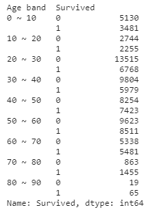
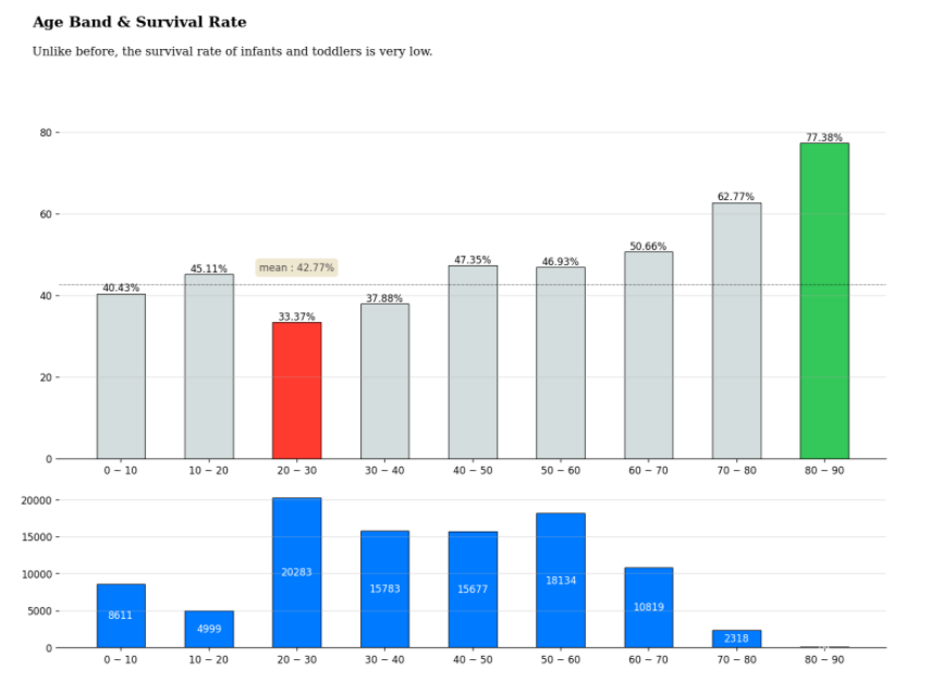
def age_band(num):
    for i in range(1, 100):
        if num < 10*i :  return f'{(i-1) * 10} ~ {i*10}'

train['Age band'] = train['Age'].apply(age_band)
titanic_age = train[['Age band', 'Survived']].groupby('Age band')['Survived'].value_counts().sort_index().unstack().fillna(0)
titanic_age['Survival rate'] = titanic_age[1] / (titanic_age[0] + titanic_age[1]) * 100
age_band = train['Age band'].value_counts().sort_index()
from mpl_toolkits.axes_grid1.axes_divider import make_axes_locatable

fig = plt.figure(figsize=(15, 10))
gs = fig.add_gridspec(3, 4)
ax = fig.add_subplot(gs[:-1,:])

color_map = ['#d4dddd' for _ in range(9)] #d4dddd 값을 가진 9개의 원소를 포함한 리스트 생성
color_map[2] = light_palette[3] # Red
color_map[8] = light_palette[2] # Green


bars = ax.bar(titanic_age['Survival rate'].index, titanic_age['Survival rate'],
       color=color_map, width=0.55,
       edgecolor='black',
       linewidth=0.7)

ax.spines[["top","right","left"]].set_visible(False) # 위, 오른쪽, 왼쪽 축 감추기
ax.bar_label(bars, fmt='%.2f%%')


# mean line + annotation
mean = train['Survived'].mean() *100
ax.axhline(mean ,color='black', linewidth=0.4, linestyle='dashdot')
# 그림에 주석 달기
ax.annotate(f"mean : {mean :.4}%",
            xy=('20 ~ 30', mean + 4),
            va = 'center', ha='center',
            color='#4a4a4a',
            bbox=dict(boxstyle='round', pad=0.4, facecolor='#efe8d1', linewidth=0))


ax.set_yticks(np.arange(0, 81, 20))
ax.grid(axis='y', linestyle='-', alpha=0.4)
ax.set_ylim(0, 85)


ax_bottom = fig.add_subplot(gs[-1,:])
bars = ax_bottom.bar(age_band.index, age_band, width=0.55,
       edgecolor='black',
       linewidth=0.7)

ax_bottom.spines[["top","right","left"]].set_visible(False)
ax_bottom.bar_label(bars, fmt='%d', label_type='center', color='white')
ax_bottom.grid(axis='y', linestyle='-', alpha=0.4)

# Title & Subtitle
fig.text(0.1, 1, 'Age Band & Survival Rate', fontsize=15, fontweight='bold', fontfamily='serif', ha='left')
fig.text(0.1, 0.96, 'Unlike before, the survival rate of infants and toddlers is very low.', fontsize=12, fontweight='light', fontfamily='serif', ha='left')

plt.show()